Blend Group
We were commissioned to rebrand and reposition Blend Colours, a 25 year old, family-owned B2B plastic manufacturer with a global footprint in 70+ countries, into a future-facing organisation.
Services
Brand Strategy, Brand Identity system, and Brand communication

Redtin Studio shaped Blend’s identity as a shift - not a departure, but a clearer articulation of what has always existed. Rooted in "Conscious Chemistry", it brings a unified way of thinking across materials, processes, and decisions.
To build clarity before aesthetics, we merged fragmented entities -
bringing Blend Additives, Blend Colours, and other sub-brands under one parent, the Blend Group.
Consolidating the name to make it more inclusive and relevant across diverse market segments.
This ensures Blend is perceived consistently across markets, strengthening the impact of the parent group while enabling customers to see the full breadth of its offerings across products and services.

We went back to the fundamentals of chemistry - studying molecular structures, chemical bonds, and apparatus as basic as a petri dish. The idea of molecules coming together within it became a reference - capturing the act of blending at its most fundamental level, and symbolising the core function of the business.
Our approach was to establish a framework through which all decisions could be viewed across materials, processes, and the way the company grows. It needed to align with the core values upheld by this family-owned business.
This led to a simpler, and perhaps harder question -
"How conscious is every decision we make?"

That question gradually became what we now call “Conscious Chemistry.”
Not as a claim.
Not as a campaign.
But as a way of thinking - before action, before scale, and before design.
Because when the thinking itself is conscious, the outcomes tend to follow naturally.
Grounded in the five elements of nature (Panchatattva), it ties back to the core values -
EARTH
Science with Responsibility
Grounded and deliberate, we engineer with care for every material we touch.
WATER
Rooted in Culture
Adaptable and flowing, we honour legacy while evolving forward.
Innovating with Intention
We transform with meaning - not disruption for its own sake, but evolution with purpose.
AIR
People First
Open and sustaining, we build safe, inclusive, and empowered environments
SPACE
Accountability in Action
The space where all things connect - where intention becomes measurable impact.

Conscious Chemistry
When the thinking itself is conscious,
the outcomes tend to follow naturally.

The symbol evolves to integrate molecular interactions, the act of blending within a Petri dish, and Conscious Chemistry, rooted in the Panchatattva.

It establishes a unified framework for the parent group that extends across
its sub-brands, products, and practices.

Grid courtesy
Shri Poosapati Parameshwar Raju
Typography is a key expression of Blend’s visual identity. Our fonts are chosen to reflect who we are - modern, confident, and conscious - while ensuring legibility and consistency across all brand touchpoints.
Bozon
Modern, precise, and forward-looking, yet balanced and approachable.
Poppins
It is free, widely available, and perfectly complements Bozon, offering excellent legibility across screens and platforms.
Poppins will be used in Word, PowerPoint, Excel, emailers, and digital
templates, ensuring a consistent brand presence in everyday communication.
To bring clarity to offerings, simplifying navigation, and aligning capabilities with specific market needs, the business was structured into three clear verticals -
Masterbatches, Additives, and Compounds
with sub-brands under each vertical.
Masterbatch Business
Compounds Business
Additives Business
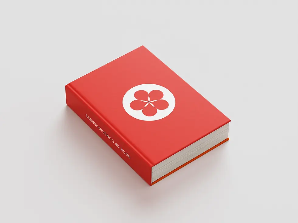
Book of
consciousness
serves as the definitive guide to the brand - bringing together its philosophy, visual system, and communication principles. It establishes a clear reference for how Blend is understood, expressed, and consistently built across every touchpoint.

Blend’s written communication spans multiple tones and audiences.
Using Bozon and Poppins, the rebrand establishes a typographic system with clear typesetting guidelines - adapting seamlessly from functional, technical documentation to more expressive brand and communication touchpoints.


As part of the rebrand, we extended Blend’s philosophy into a sensory experience,
translating Conscious Chemistry beyond visuals into fragrance.
Created as a B2B gifting piece, Soul of Nature embodies the brand through scent - fresh, balanced, and intentional. It reflects a way of creating where materials are chosen responsibly, innovation is purposeful, and impact is considered at every step.
Grounded in the Panch Tattva: Earth, Water, Fire, Air, and Space
The fragrance brings together creation, balance, and accountability, offering a tangible expression of a brand that is not only seen, but also experienced.


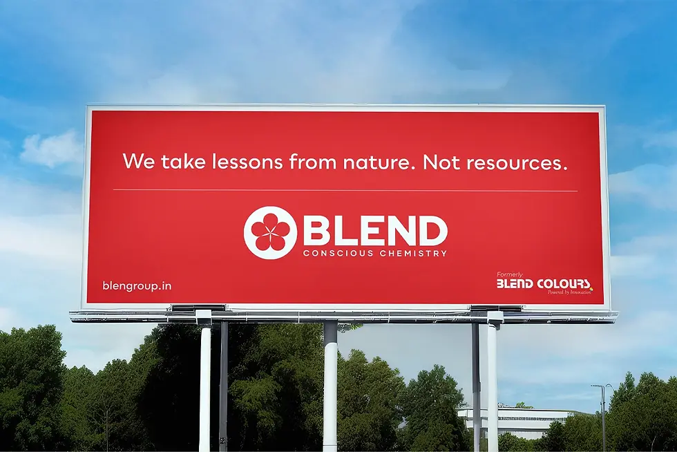
The communication was designed to be direct and confident - reducing complexity to what matters most. For the rebrand rollout, especially in high-visibility environments like global expos, the focus was on pairing strong visuals with precise, purposeful copy.


A rebrand built on clarity - unifying structure, defining intent, and creating a system that scales consistently across markets, communication, and experience.
END OF PROJECT


